Wednesday, January 29, 2014

The ugliness on the internet

Some time ago, I felt compelled to respond to an ugly comment left on someone else's blog. I know, I know, don't feed the trolls. I just get angered by petty behavior. Today, I notice a response that I am assuming is from the same person due to the venom toward me for my response. If not, it is a person of equal character. So, they decide to turn around and attack me. For some reason this person thought the ugly comments were a positive thing, and that this kind of behavior was justified because we live in a democracy. Then, they decided to do call me names.

It really puzzles me why people think that we are entitled to say anything to anybody because we live in a democratic society. Sure, you have the right to, but should you? Does opening yourself up on the internet really entitle others to criticize you mercilessly? I don't think so. I think human decency trumps the need to belittle others for your enjoyment. And people who are nasty and belittling should be called out.  But where do you draw the line? How do you know if the person is a troll, and is merely making ugly comments all over the place as sport, or is just a person who needs a little scolding? I don't know. Are they the same thing? Possibly. I know I should just ignore all comments because they will only serve as a reminder of how many horrible people are out there furiously hurling insults and conspiracy theories. They are frequent users of the word "sheeple" and are very quick to try to justify their actions behind the shield of democracy. They are the dredges of humanity, and I know their bad behavior does not represent most of human society, but they bring us all down with their nastiness.  Just food for thought.

Kittehs make everything better.

Tuesday, January 28, 2014

Fun with cheap (and not as cheap) art supplies

After taking Alisa Burke's Sketchbook Delight class, I became enamored with the idea of painting with water soluble markers. I stocked up on every cheap set I could get my hands on and did a little playing. After this class, I also decided to try some different brands of cheap watercolor paints, like Crayola and SimplyArt. The Crayola watercolors are remarkably smooth and richly pigmented. I really loved them.  Although I felt the class was for absolute beginners, and I am more out of practice intermediate, I did get great tips on cheap supplies and new ways to play with them.

I also invested in some watercolor crayons and Neocolor IIs, which I have been coveting for some time. They are also very fun to work with. I plan on expanding my collection of Neocolors over time, as Dick Blick has open stock reasonably priced. I would love a set, but they are just too expensive for me to do them that way.  

Cheap markers

Cheap watercolors with crayon resist

More crayon resist

Staedtler watercolor crayons


Cheap watercolors and crayon resist

Markers
I am SO proud of this! I had a page scuffed up with walnut ink, and drew over it with Neolor IIs and Staedtler watercolor crayons.

Crayola watercolors

Monday, January 27, 2014

So, it has been a long time since I wrote an entry. Far too long. Many things, good and bad, have happened since then. I got a job, finally...one that will give me much needed experience for better things to come. Unfortunately, the job is not what I would call good paying or with many people I care at all about. The boss above my supervisor is a micromanaging woman who seems to feel the need to have a target of ire. I seem to be that target now. So, I am currently seeking greener pastures before she tosses me out. I am not, however, going down without a fight. I have an ally who carries some weight with the owner, so all is not hopeless.

Let's see, I have also had very bad problems with my shoulder, which are very slowly improving with the help of my new, most awesome doctor and a great physical therapist. I have also had other health challenges, which I will not bother you with. On the very positive side, I have lost close to 20 pounds since I started my job in mid-April. That is not so much, especially when I need to lose over 100 pounds, but it is the result of some positive changes I have been maintaining for the last 10 months. These are habits I can maintain, and they don't involve deprivation or working out to exhaustion. I have been wanting to incorporate more strenuous activity, but the things that appeal to me all involve things I cannot do until my shoulder is healed.

I have feathered my nest a bit, too. I had a massively good Christmas, which afforded me the ability to get some furniture, albeit cheap, to make my apartment look more like a home than a hoarder's dorm room. I actually have a pantry and a real dresser! There are a few more things I would like to get, but they will have to wait for a while.

I was also able to replace my horrible Kindle keyboard with the cheap, regular model, which seems to be much sturdier. I went through 6 Kindle keyboards and they all had problems. For most of them, the problem was that the screen would crack if you breathed to heavy near it. The last one, appropriately named "Last Chance" would only keep a charge for a few minutes, even after I put a fresh battery in. So now, I am working on getting back into the reading habit. With my last Kindle,  I was reading "Under the Dome" by Stephen King and only made it less than 1/8 through. In less than a month, I have more than doubled what took me a year to do. Mind you, I have had less than stellar concentration levels and I have been fighting bugs for close to 2 months, so I couldn't be bothered most of the time. That is starting to change. I used to be a voracious reader up to the time I started college. I graduated almost 14 years ago, and worked at a library for 5 years, and still never regained that passion. I will get it back or die trying!

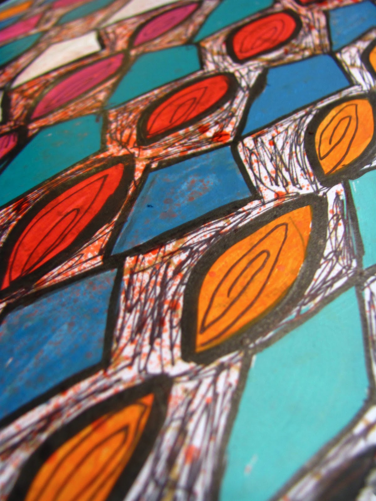
As for art, I have gone through phases of working on painting faces more realistically to using markers to paint faces with some realistic shading, to Gelli printing to doing actual written journals on the painted pages of paper grocery bag journals I made. I even started making a calendar on a grocery bag journal, but only fully completed 3 months. Those three months look awesome, but I found that a smaller, regular sized calendar would be a better fit for me, especially after the bugs I was fighting wore at me and I no longer had the energy or motivation to complete the homemade one. I have been in another lull, so I have worked on reorganizing my supplies again. That is always a good project when you are not feeling inspired.

While I am recovering from my crud-a-thon and the very slow-to-resolve aftermath, I thought I would remind people that I am still alive. Now and then, people do take a look at this blog and I feel bad that people may have given up on me. I know how I feel when bloggers I enjoy reading fall of the face of the earth.  It may be the end of January, but it is never to late to stage a tentative return.

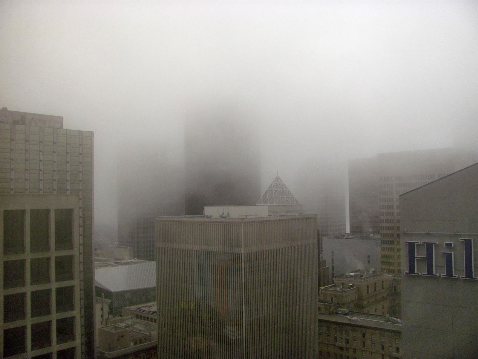
As a reward  for sticking with me through my wordiness, here are a few photos I took from my office window this summer. Downtown Seattle has been beautifully surreal over the past 10 months with more fog than I have seen in the 7 years I have lived here.  Enjoy!


Tuesday, April 2, 2013

Journal Covers-a-Go-Go

In a previous post, I chronicled my exploits cutting stencils, fairly complicated, fiddly stencils. Whenever I start doing a project, I tend to go for the most complicated thing possible to start, then I work my way to the easy stuff.  True to form, I did that with stencils. The easiest stencils you can made are the ones where you take a strip of thin cardboard from some packaging, fold it in half, and cut shapes in it. Well, maybe even cheaper is to take those same strips of cardboard and punch holes out of it with a paper punch. To do that, you need to make sure your cardboard, or whatever you use, is not too thick. Here is a sampling of the ones I made:


I used these stencils in a couple of different ways to create two very different, distinctive journal covers. For the first, I traced the designs down the page, painted them with craft paint, then did outlining and marking with technical pens.


I like that it looks like a woodcut from the 1950s or '60s.
Looks even better close up!
The other way I used the stencils was to just go crazy with a few colors of paint and a makeup wedge. I just pounced and pounced until I felt I was done, and then I pounced a little bit more. Then, I took a stencil I hadn't been using (the stars) and colored in the shapes with a white gelly roll pen. I almost forgot, I traced the circles in Inktense Pencils to try to give more contrast. I am not sure it was that successful, but it doesn't really take anything away from the page.


I am finding these stencils of simple shapes very versatile. There will definitely be more to come in the future. They can be used in an overall design, as an accent, or as texture. They can be used with paint, pencils, markers, dabbers, sponges, pastels, or anything else you have laying around. Ad the best thing about it is that you are using materials that are readily available, no extra purchases necessary. And don't forget you are recycling!

One more cover to add, but this was done freehand.

Yes, this was done on materials I received from the doctor before my sinus surgery. If you have any kind of paper, you have a journal surface!

Monday, April 1, 2013

Purging and Painting

I seem to not be so good at doing much on a regular basis these days. Hopefully, unemployment will be one of those things. Yes, it has been 8 months, officially, this time around. Last time it was a week shy of a year, so I really hope to not get that far. I find myself increasingly more stressed and frustrated at my situation, and looking for ways to get out of this rut, you know, use some of that good old American ingenuity. One thing I am doing is going through my countless DVDs and CDs and picking out ones I can live without. Seeing as I am 99.999% digital these days, and most of what I watch and listen to is on my back up drive, I can live without most of them. So, I am peddling and pandering to anyone who will listen. If I figure out how to sell directly through my blog, I will do so. Until then, I started the ball rolling with a friend, and I am selling some of my DVDs through an online service. A few of my DVDs will get a decent amount of money, so for those, I am using that option. When I got rid of all of my CD jewel cases, I didn't keep the back cover, you know the one with the UPC code. So, without a UPC, I cannot sell to those convenient online places. I will have to take my chances with person to person sales or eBay.

In addition to decluttering my media collection, I am looking into what kinds of goods I can have made with my photos and designs. I am thinking about opening an Etsy store. There's so much stuff there, I will have to learn how to market. I also need to figure out specifics, so I can make a business plan and go on Kickstarter to try to raise my start up costs. I obviously do not have the money to take any risks with.  I will be working on reworking some of my more popular journal pages on flat paper, so I can scan them into Photoshop Elements and tweak to my liking as digital images that can be put on t-shirts, fabrics, papers, cards, keychains, calendars, etc.  If anyone has feedback regarding this and what kinds of products you would like to see, please look at photos from past posts and leave a comment.

About my work, it is obvious by looking at my past work, I like simple graphics with bold color and line. I definitely do that best, but I am also interested in growing my skills. I am not a great painter or drawer, hence my style. I have been largely self taught, outside of one high school painting class and one community college class in drawing. I have several weak points which I would like to strengthen. One is painting dimensional faces, and dimensional anything, for that matter. I am not striving for realism. As I have heard many artists say, "If I wanted realistic, I would take a picture. " This is my first experiment in painting a face in a dimensional manner.

Keep this girl away from the cheap self-tanner! Seriously, this was my first attempt. She looks okay, but very streaky.

This photo is blurry, but you ca see the improvement a few more layers made. I am very proud of her nose. I think it turned out quite nice.
My little stylized goth girl. She looks cute, but she could definitely use more layers of paint.


Through this initial round of attempts I learned the following:

  • There is a reason so many mixed media artists use watersoluble crayons and pencils with gesso to create face. It would take far less effort for a good effect.
  • Painting dimension in acrylics is kind of fussy. Watching people paint online, it seems like a simple process. Just swipe paint on and blend a bit. Maybe some people are that good, but for me, the top and bottom images are one layer. The one in the middle had two layers, then I gave up and gessoed over it all. Then, I created two more layers. I am beginning to think two layers is the minimum. I may change my mind as I learn.
  • I have great respect for people who can paint fine lines with a brush. I just cannot. Too much coffee? Not enough coffee? Whatever the reason, I cannot seem to get a crisp clean line with a brush. I have even practiced by painting designs and thinning the paint so it flows more smoothly, but I am not there yet. Than God for technical pens and gelly roll pens. 
  • I think I can get good at this. I know I can create unique faces by drawing, so I have a good base for painting. These are my first two paintings, and they look decent. It gives me a lot of encouragement. 
  • I am not one of those people who puts faces and quotes on every journal page, nor do I really want to be. It just isn't my style and I feel it is being done to death. Even so, I like to know I can have options on what to draw and paint, another tool in my arsenal.
The goth girl and the other faces I drew earlier in the year have been glued into the pages of a couple of the signatures from that book I made from paper grocery bags. You can see the type of the bag in the goth girl painting, which I am not fond of, but I am not changing. The rest of the pages with type will be treated differently. I am hoping that I will be a pro by the time I finish that last face. I think that book will end up being the book where I practice new things. Of course, I do that in my other journals, but this will be intentional. I have a spread in another book I have designated for practicing painting spheres. Slowly, but surely, I am bringing myself around to more serious work, as serious as art work can be, that is.  It has taken a few months, but I am finally feeling the confidence to put in some time. If only my body would cooperate with me!


Thursday, March 14, 2013

Journal Page Mania

It seems that my current state of unhappiness and discomfort over my length of unemployment have been good for me creatively. Over the last couple of weeks, I have been on a spree. Some pages are still very much in the beginning stages, and many are complete.

A crazy undulating mass of doodles.

This is only a background, but it was so pretty I knew I would mess it up somehow. So, I am keeping it just the way it is.

More colorful doodling.

This page is journaling, covered with patterned tissue paper, covered by paint and more journaling, then covered with gesso and Portfolio pastels. I got a lot of frustration out on this one.

The cover of my art journal. It is a nice small, manageable size. So manageable, in fact , that I only have a handful of pages left before I have completed this journal!
All of this frustration is also finally making me reach my melting point, so I started running on my mini-trampoline to get it out. Art journaling is just not enough. I find it amazing how many employers seem to treat me as un-hirable. Even in positions that I held for multiple years, ones I excelled in, ones that are entry level positions. When I actually do get feedback, I am told I did really well, but someone happened to have more experience or I am not qualified for the position. 13 years of clerical experience apparently means nothing if you have had a couple of bouts of bad luck. Anyway, I had a good cry this afternoon, put on some Tool, and pounded out my frustration and anger and everything on my mini trampoline. It will hopefully help me lose weight and the emotional load I am carrying. If people are using my weight as a reason not to hire me, I am going to do my best to take that away from them.

So, here's to getting through the rough patches with humor, integrity, and art. I got through this once (only a few years ago); I can do it again.

Wednesday, March 6, 2013

Portfolios, where have you been all my life?

This week, I completed two journal spreads. They both have one thing in common. Portfolio water soluble oil pastels. After using them in the spread from my last post, I fell in love with the smudgy quality. It gives a really neat quality to the image, like it is slightly out of focus. If I had known about this super cheap medium, I would have purchased some long ago. I am much more comfortable drawing than painting, especially when there is even a modest amount of detail work. Portfolios lend themselves to a looser style, more "artistic," and less technical. I think I will be doing many more pastel drawings in the future. Now that I have gotten a taste of creamy textured oil pastels, I think I may actually try out the more expensive oil pastels one day. This is exactly the type of thing I was hoping to get out of art journaling.

This first spread was done on the instructions from my sinus surgery a year ago. It made me think of a skull. I went a little overboard with the canine teeth, so it looks a little like a vampire skull, but I think it gives it character.


The other spread was started when I had a bunch of paint and glaze leftover from a somewhat failed attempt at painting a face. I just painted short brush strokes all over the pages. The next day, I took some cheap paint markers I got from Daiso, the Japanese dollar store, and painted in some circles. The rest sprang out from that. The colors and shapes remind me of paintings from the early abstract movement. The colors do, especially. I am a fan of heavily saturated color, so this is a little foreign to me, but I do like it.


Tomorrow, I am going to the Seattle Art Museum. There is a special exhibit including such artists as Gainesborough, Van Dyck, and freakin' Rembrandt! When I took art history in college, I had to do a paper comparing two randomly selected artists from a hat. I selected Rembrandt and Hals. The Hals portrait I chose is in this collection! It ought to be a very inspiring evening.